HBO.com
UX Design
Design Systems
UX Design
Design Systems
Platform Migration and Redesign of HBO.com, the official website of HBO.
As part of the efforts to migrate HBO.com from AEM (Adobe Experience Manager) to Drupal, I worked with the Senior UX Designer to establish a Design Library & Styleguide, assist in content automation, and efficiently (re)direct Users to HBO MAX.
As part of the efforts to migrate HBO.com from AEM (Adobe Experience Manager) to Drupal, I worked with the Senior UX Designer to establish a Design Library & Styleguide, assist in content automation, and efficiently (re)direct Users to HBO MAX.

Website Styleguide
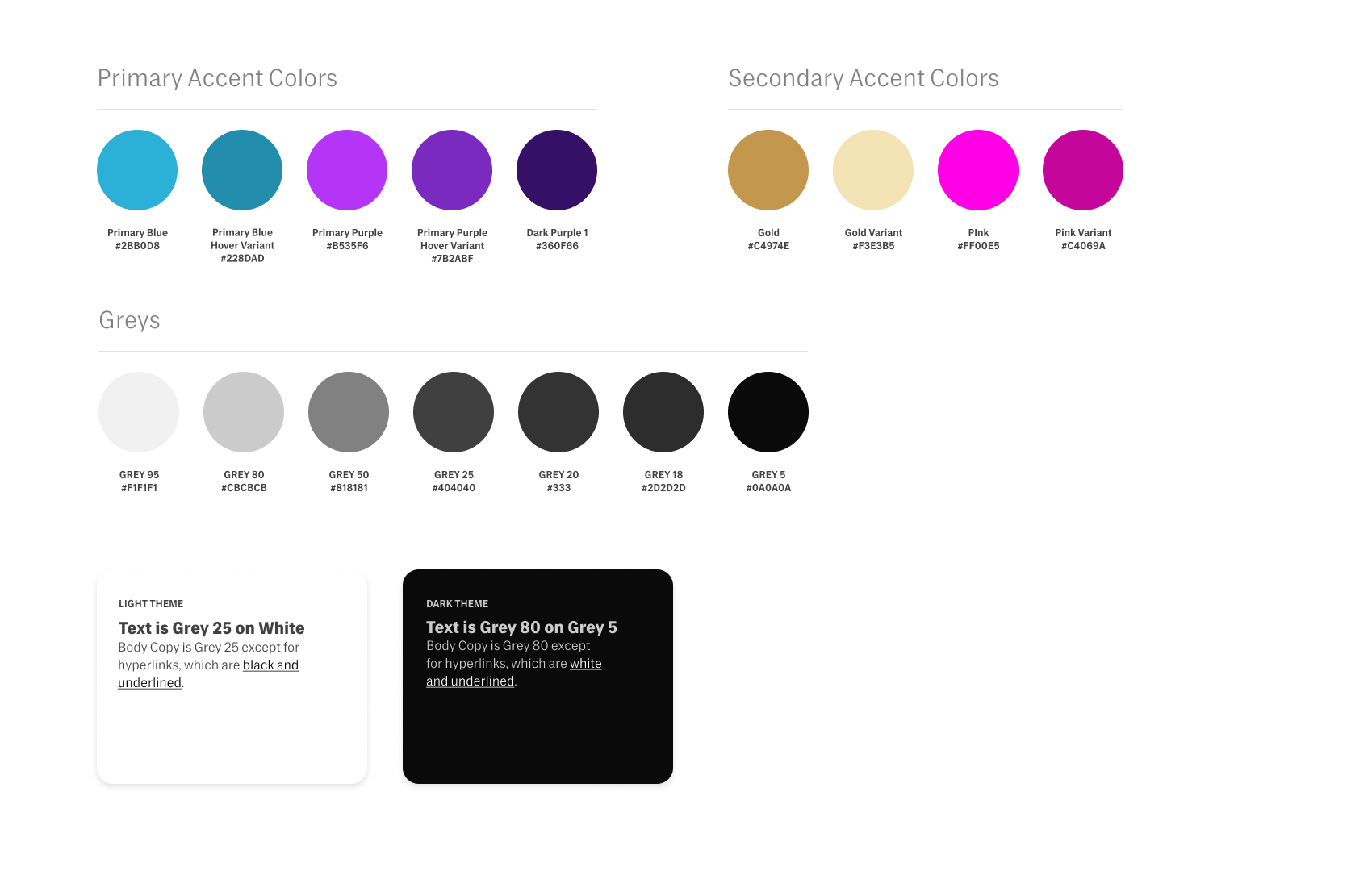
HBO.com primarily features dark text on light background, with Primary Blue as the website accent color. Primary Purple was introduced in reference to HBO Max’s Brand colors, and used for all direct links to HBO Max.

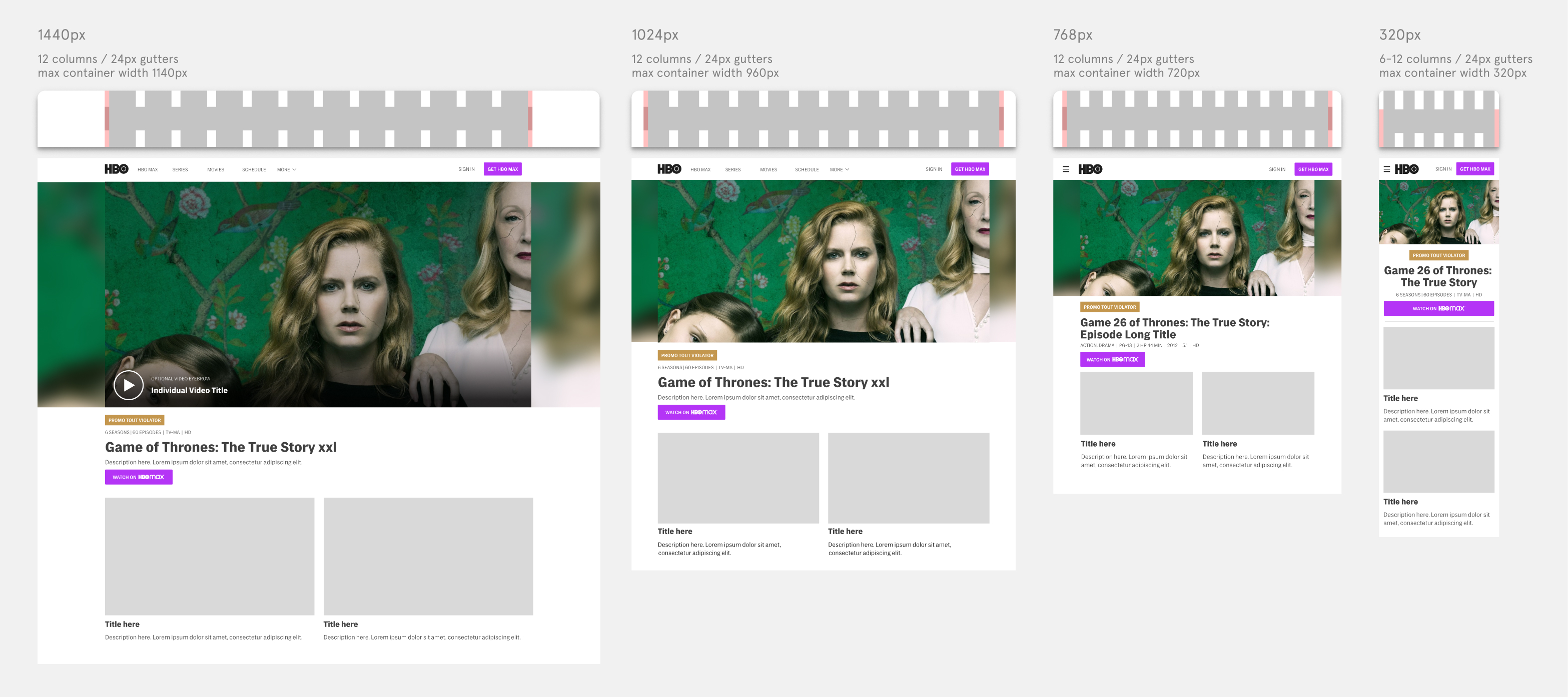
Breakpoints and Grids
The Bootstrap 5.0 Grid was adopted as the new basis for hbo.com. This helped ensure website responsiveness and proper display across all screen sizes.
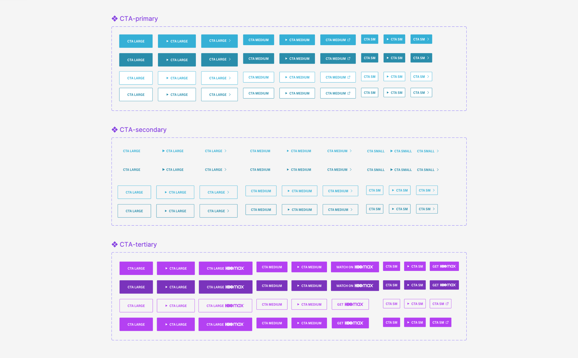
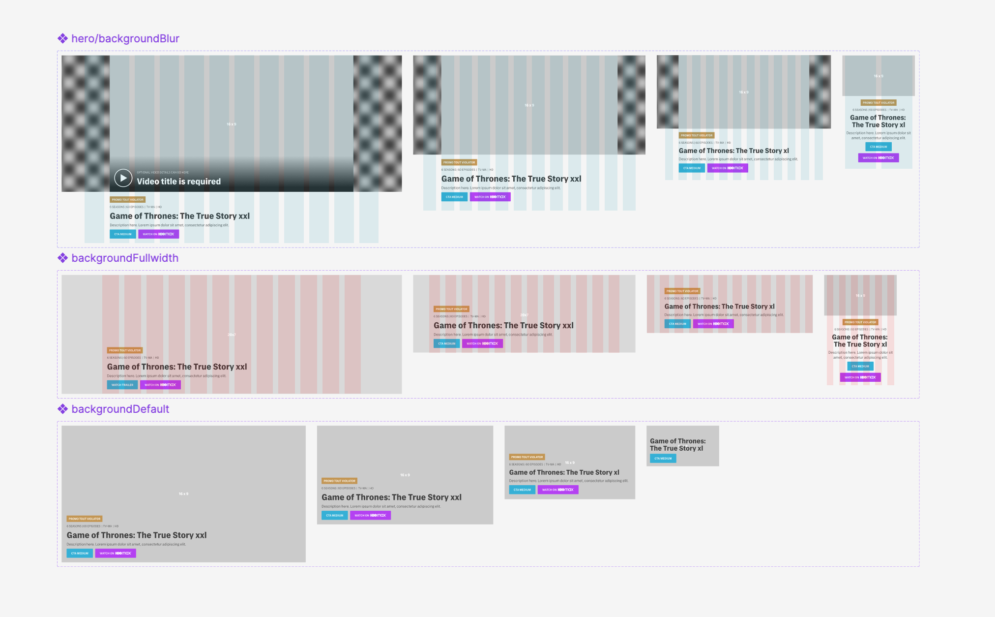
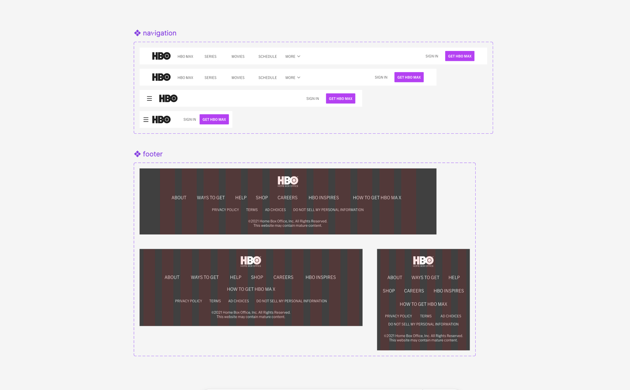
Design Library
The Design Library is routinely updated, ensuring that all components reflect its newest version. Responsive components are available at various breakpoints, and can be auto populated with individual series’ information.

Updated Pages
The implementation of the new Design Library Components, combined with content automation, lead to a revamp of hbo.com.
As a result, all Series’ pages became more consistent and cohesive, giving us the opportunity to efficiently guide our User’s towards HBO MAX. A comparison of the old and updated series pages can be found below.
As a result, all Series’ pages became more consistent and cohesive, giving us the opportunity to efficiently guide our User’s towards HBO MAX. A comparison of the old and updated series pages can be found below.
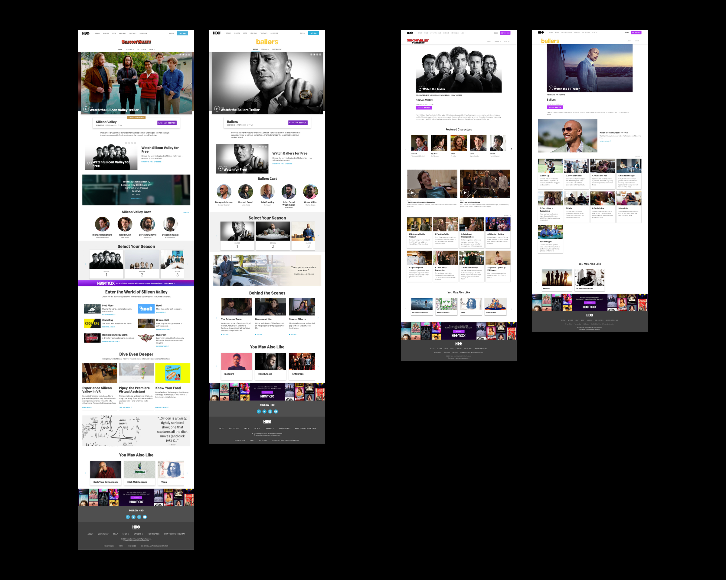
Old pages for Silicone Valley and Ballers (left), vs. newly automated pages (Right)
Landing Page
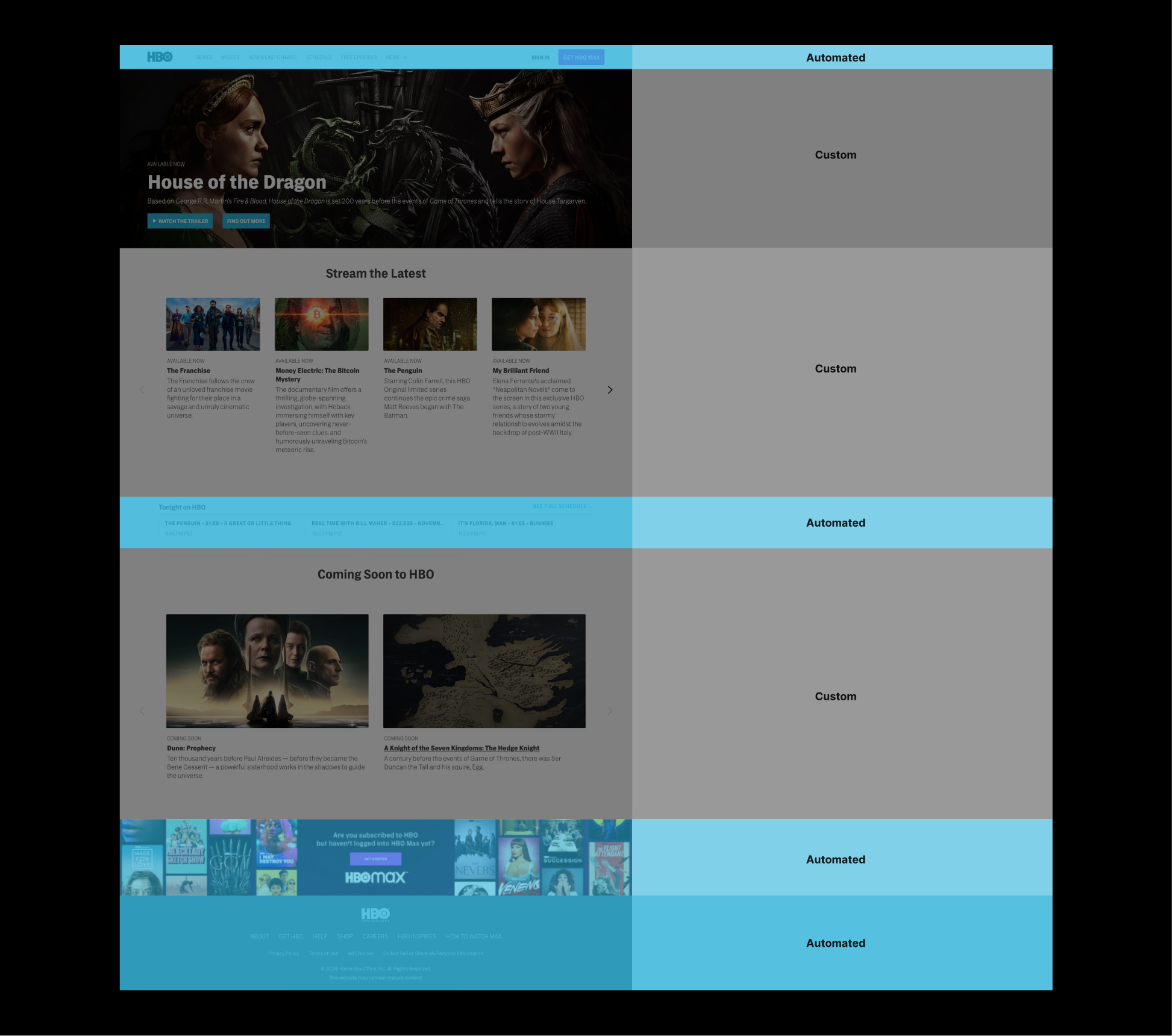
The updated hbo.com landing page features a combination of custom and automated content.
While custom content helps secure user engagement and retention, automated content allows for scalability and consistency across the website.
While custom content helps secure user engagement and retention, automated content allows for scalability and consistency across the website.